

My thought process started with the tile, "sleep', which I wanted to center at first because it would make the poster feel more restful. However, after playing around with location I decided that bleeding it off the bottom of the page (a bit to much I thought the next morning) would make things more restful and make it seem as if the letters were being tucked in by the surroundings. "hello friend" became the sub-head because, well, sleep is my friend. For the body copy I ended up taking the conclusion from my Sleep research paper in high school. Awesome, right? I liked how the rag looked at first, but after awhile I realized that it just didn't fit with my concept. Too jagged. I also was a bit unsure of how to fit the body text into the poster. A thin vertical paragraph seemed to work the best, but I was still troubled over it. The graphic work on the bottom of the screen was created originally from EEG scans of sleep patterns (notice the smooth delta waves...) and different stages of sleep. They could also represent blankets on a bed. I chose a very thin serif typeface (Archer: Hairline & Thin) based on two reasons: serif because it's not as bold and business-y and san serif, the serif keeps it more classic (and sleep is not an age old thing right?) and thin because it's more quiet and gentle than bold typefaces. I also enjoy the terminals on the Archer typeface: beautiful.
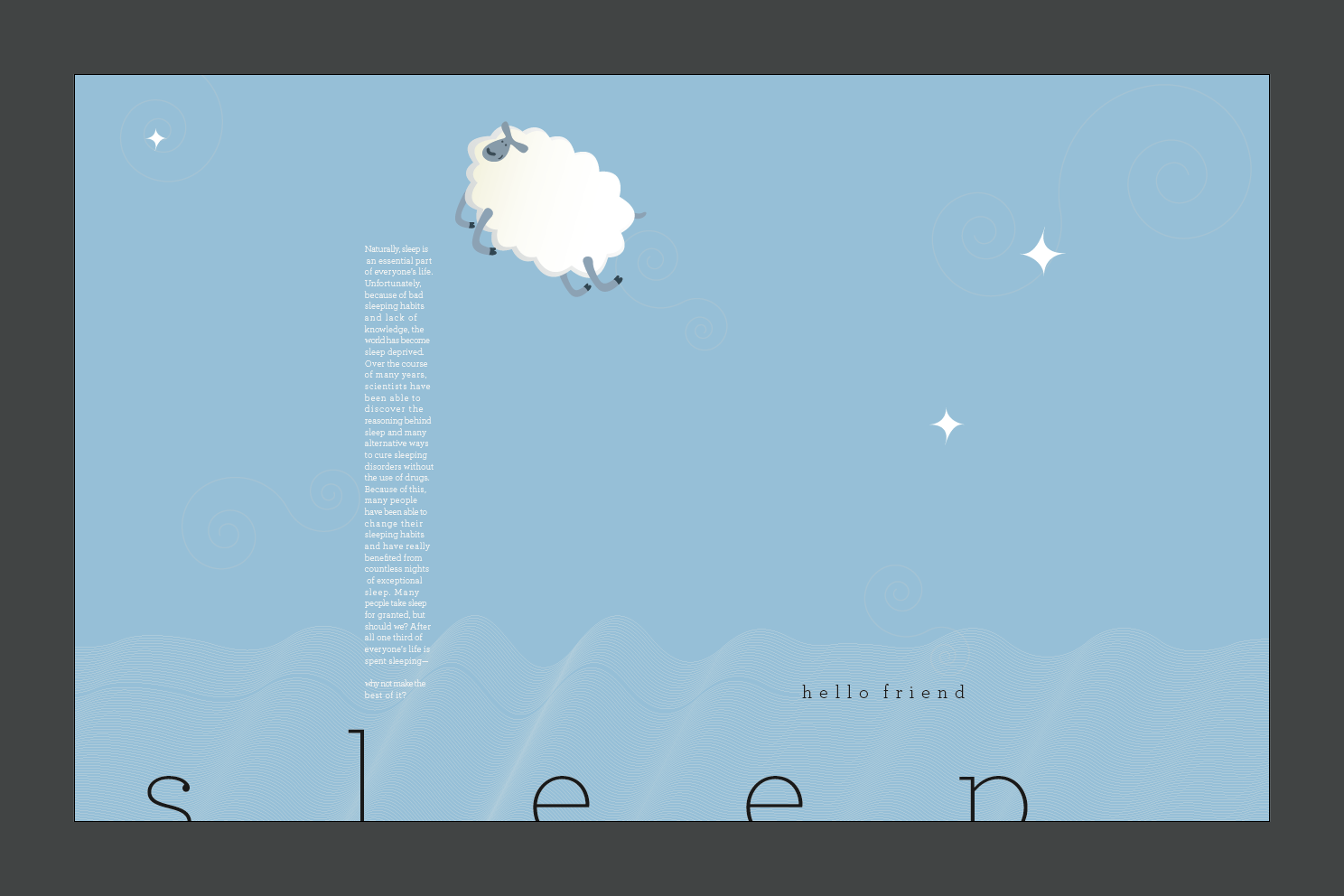
Ready for the revamp? I kept some of the same elements, and added a few. I changed the background to a soft blue to create more of a calming, dark feel and the body text to white. I also eliminated two of the EEG patterns and just went with the first, the way I duplicated them created a nice soft glow on the left side (as my friend Gwen said, "it looks like a soft moonlight") and reminded me of either clouds, a blanket, or delta waves as we sleep. I removed one of the lines to bring attention to it, to give a direction to the subhead. I moved the title up a bit so it didn't bleed as much and scooted it over so it wasn't as static in the center. I added a fluffy white sheep (with more fluff than body) for a few reasons. 1) Counting sheep 2) Fluffy and soft (much like a bed) and 3) it looks like a dream bubble. Adding the sheep jumping over the body text fixed the issue I was having with integrating the body text with the rest of the poster. I added a few stars to add some direction to the sky and balance the poster visually. The stars are positioned to point to different sections of the screen (the subhead, body copy, etc). During crit. Margo had also mentioned that she would like to see some subtle swirls in the background to bring a more dream like aspect to the poster. After adding those she was right, they add a nice flow to the poster that was lacking before. Anyway, here it is, my final poster of Typography 1 at CCS!

No comments:
Post a Comment
While you are here, help me out and leave a short comment on what you think. Anything is fair game. Like it? Hate it? All I ask is that you please keep it tasteful. Thanks!