Onto the final book! Assignment III was a lot like Assignment II, although it was a bit more intense. This time we were allowed all variables (including color and photos), able to create a new grid from scratch. Additionally we were able to type pair another typeface for our book as well. I choose not to do this because of Goudy Old Style's unique qualities. Our final book was to be bound perfectly (not accordion this time) and presented as a mock-up of what the designed book would look like after publication. Once done we would present our book to the rest of the class as if they were clients. The body text of our final book would be the paper we had already written on our typeface + history about the typeface and the typeface designer. We had to include photos this time (and that created a new challenge of its own), which could be found or our own (she encouraged us to use the images we made from assignment I). The book had to represent the typeface and designer in the best form possible.
Here is my thought process for Goudy Old Style. Goudy Old Style is elegant, organic, playful, timeless, one of the most legible typefaces to date, and perfect for both body text and display head (titles and such). After doing some research, I found a quote from Goudy himself explaining how he goes about designing typefaces. He says, "Well, it's very easy. You just think of a letter and draw a thought around the idea". This got me thinking. How could I incorporate the essence of his thought process? Initially I was focused on creating a design that would be elegant, legible, and playful.
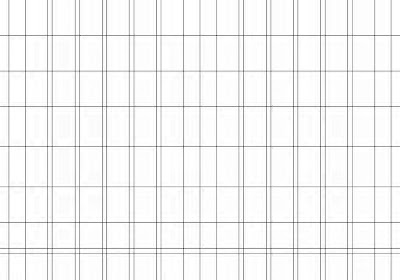
Leaning away from my mistakes of my first grid I decided to have 6 columns per page (a total of 12 per spread) with generous margins on the side and a standard gutter. Here is how my grid turned out.
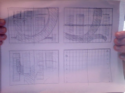
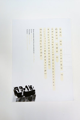
First step. Thumbnails. I went through many thumbnails, but these were the thumbnails I ended up with eventually.
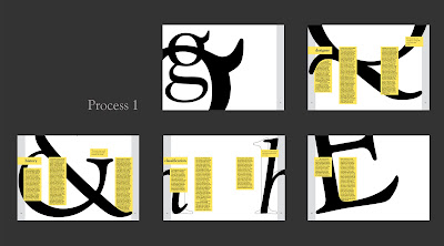
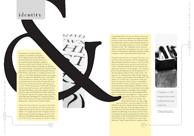
I was having difficulties bringing elegance into the design at first until I looked over the picture I had gathered up from the web and ones of my own. From assignment I, I had created a couple images that were very elegant—many of them were large close-ups of letters. After some experimenting I found a way to bring elegance into the spreads by using those large images and intermingling the text among them. This created a sort of elegant playful design that I enjoyed. I chose letters based on their uniqueness to Goudy Old Style. The g's because they turned out the best and were so-very elegant and unique to the typeface. The Q because of its elegant form and unique double tail, the h's to hightly the slight italic difference and because of their elegant swish, the ampersand because of its beautiful nature, and the E because of its unique final. I chose to put the body text into yellow modules that would intermingle with the larger images. I chose the color yellow based on color theory: black lettering on yellow makes the text more legible (which is why you should always study with yellow legal pads and black ink). Here are my first results after translating the thumbnails into InDesign. First time around I went with two columns per page—later that'll change. The pull-out quotes I separated from the body text but didn't put much though into how the related too much with the body text. I periodically would save version for process work. Not everything is complete but I will point out the differences I made between each version.
I added the grey bars on the sides to add another color to the page and to structure the image in something. I later would get rid of these. They were last minute decisions that I decided I did not like. Here is the difference.
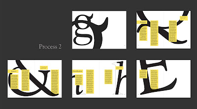
Something wasn't sitting right with the columns, I instead of having them at even proportions across the spread (which unintentionally made them more static), I increased the width of the left column and decreased the width of the right column to provide an asymmetrical balance to the spread. I also stretched one module per spread off the page to add an element of surprise on each page. Yes. More interesting. Additionally, I felt as if the headings were getting lost at the side of the page and added to the feeling that all the text was constrained in a lateral field (with margins above and below with exceptions of pull-out quotes). I moved the headings to the top of the page and included a grey box behind them. This really helped even out the stark black and yellow industrial feel I was getting—I even muted the yellow color too because it was becoming too bold and taking away from the elegance. I changed a few of the larger pictures out (that E) because it wasn't as cohesive with the design and replaced it with an uppercase P (which is unique to Goudy Old Style because of it's open counter). Additionally I began playing with the idea of incorporating the entire alphabet into the book somehow. I thought I could maybe tie it in with the page numbers but wasn't sure how to do that. The quote I mentioned earlier got me thinking about outlining certain numbers within the alphabet to indicate to the reader which page they would be on (based on their location within the alphabet). ie: (a b c) would be page 1, (d e f) would be page 2 and so on. I wasn't quite sure how to do it, but this was the beginning of my process.
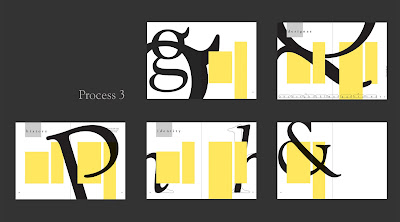
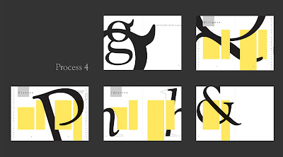
During Process 4 I continued playing around with the alphabet idea with page numbers, trying it out on the side and such because it would work better page to page. Wasn't sure I was digging it yet. To clompy; not elegant.
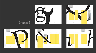
By the time Process 5 rolled around I had figured out how to do my page numbers (which are one of my favorite aspects of the book), switched around a few spreads as I began to prepare filling modules with body copy, and decided where my images and pull-out quotes would be place. I also changed the headings a bit to fit within the grey module. Although I hadn't though of it, a good friend of mine pointed out that when I did that he read the headings as separate words because they were not all together. So it was.
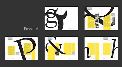
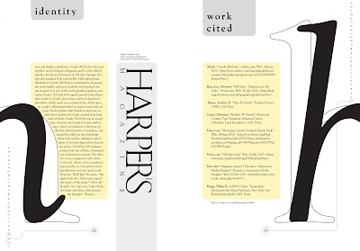
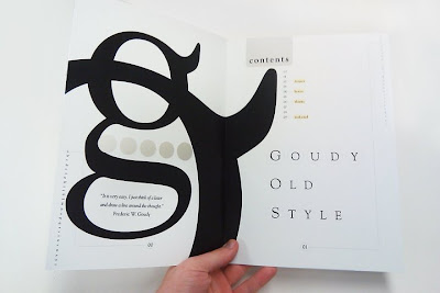
In process 6 I really focused in the second spread's look (the first page of body text), feel, and layout so that I could replicate that same feeling with the other spreads. I changed the corners of the modules to be rounded because it reflected Goudy Old Style. If you look closely, none of the letters (with exception of the uppercase G and lowercase t and f) have outwardly sharp points. All around generously rounded to give a organic, calligraphic feel. Hence, I rounded off all my outwardly corners on my modules. I fine-tuned spread one and prepared pull-out quotes for the other spreads. Spread 2 was practically complete (with minor tweaks later) and the rest would be replicated to feel like this spread. Spread 1 was still undeveloped but would contain the title page and table of continence.
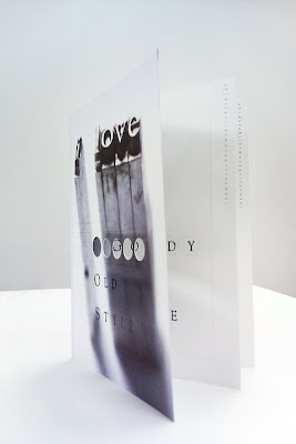
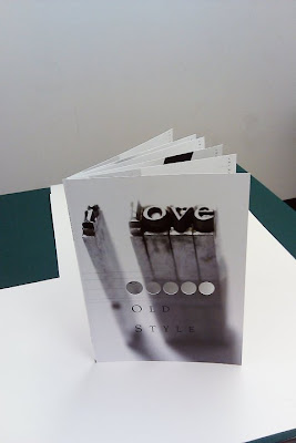
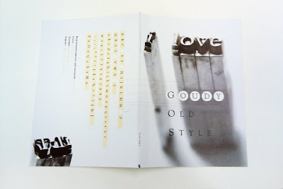
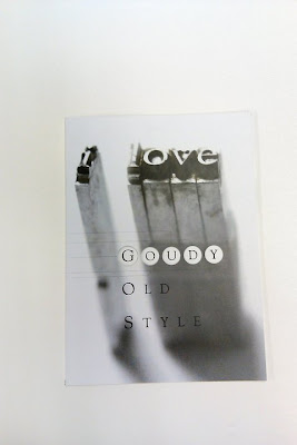
And now for the final book design! I had the most fun designing the cover and the table of continence page. Because I enjoyed my page numbering so much I decided to incorporate that into my cover design as well. On the back I wanted to sort of mimic a type specimen book by showing all the possible cuts of the typeface. I would then extract the letters of G O U D Y which would move onto the front cover to die cut circles that held the respective letterforms (actually on page 2 of the book). This tied in with my page number design and added an interesting detail on the front cover that would draw readers into the book. I found some beautiful lead type images of Goudy Old Style that said "i love typography" but I edited it to read "i love" and had Goudy Old Style below it. So the book reads "i love GOUDY OLD STYLE". The position of the title was very tricky to get right with keeping 3 pages in mind (cover for image, page 00 with the g, and page 01). In this case, form an function became one and I ended up with a fantastic result and cohesiveness. It took some brain power, but I made it happen! Also, I muted the colors even more to enhance the elegant feel for the book. Without further ado, here is the final book. After the computer images I managed to snap some pictures of the book before I had to hand it in for good.
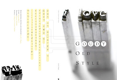
Front and Back Cover
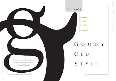
Spread 1 (pages 00 and 01)
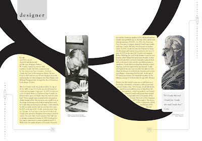
Spread 2 (pages 02 and 03)
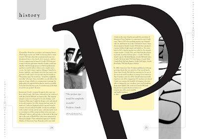
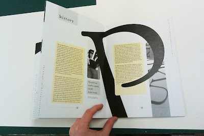
Spread 3 (pages 04 and 05)
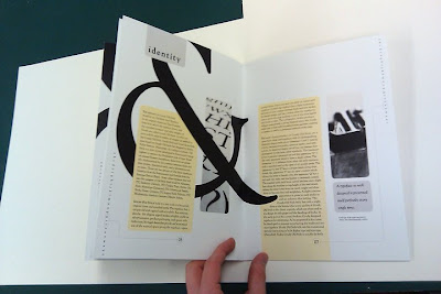
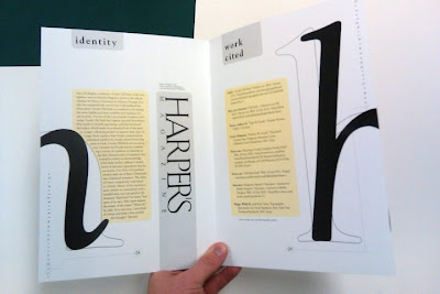
Spread 4 (pages 06 and 07)
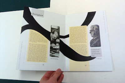
Spread 5 (pages 08 and 09)
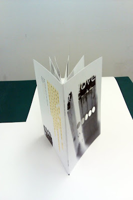
Pictures of physical book (sorry for the bad quality, my camera phone was all I had on me):
I got my book printed at Alpha21 graphics in Southfield, MI. I ended up printing the book twice because I accidentally typoed my instructors last name. Opps. I wanted to fix some of the colors as well and location of some things on the first spread anyway. I HIGHLY recommend them for any other graphic designers or students. They are a little bit more expensive than Kinko's, but worth every penny. The colors are more accurate than Kinko's (Kinko's yellow was nasty),their imaging was smooth (not patterned and mushy like Kinko's can become) and they knew what I was talking about graphic designer to graphic designer (always a plus). They were very friendly and extremely helpful. When I went back to reprint my book (because I wanted a correct spelling of my professors name for portfolio reasons) they printed it a no charge. So very nice of them. If you are ahead of your game and have time—I highly recommend Alpha 21. If you're running behind and expect them to print your things immediately upon request (they have a lot of other projects they are doing as well) I would not recommend it. Don't go in their last minute and expect to become their number 1 priority. Patience and kindness go a long way.