Thursday, August 26, 2010

Typography II: Assignment II

Ah, done with the first assignment. What could be next but an introductory assignment into THE GRID. Love it or hate it, I don't mind it. It helps me organize my thinking better. The more and more I work with the grid, the more and more I love it. Some think of it as restrictive, but I find you can really get crazy if you wanted to.

Anyway, on we go! In the second assignment we were gearing up to make four 8 page accordion fold books, the first one having very restricted specs, and consecutively allow more variables in design. We were to continue using the typeface we had chosen for our first assignment. We were given an article to use as body copy. We were instructed to create a simple grid with columns and a few flow lines. Our grid would be used on all 4 books. The point was to get the basics down first time around. Smart thinking. Here is my first grid. Looking back, I would not have created this grid the way I did, especially with such narrow columns. I struggled once I was allowed to bridge over columns. You'll see.

On a side note, I didn't realize it until now, but apparently I didn't get the best quality of pictures when I saved them from PDFs. The blurry smudgy stuff is not part of the design, just saving issues I will resolve next time.


The first book was everything being 9 pt. text. Only variables allowed were leading and tracking. Additionally we had to stay within the column of our grid design. Also, I don't know what I was thinking when I was accordion folding my book. Apparently I thought the first page should start on the outside instead of the inside which created Page, Spread, Spread, Spread, Page instead of 4 Spreads. The first book is the only book I messed this up on. After that I corrected the issue and things turned out better. Here is the first book, first an entire view of the layout to see how well the book flowed for the reader, and second postings to show what spreads looked like within the book.


Full Layout


Page 1


Spread 1 (pages 2 and 3)


Spread 2 (pages 4 and 5)


Spread 3 (pages 6 and 7)


Page 8

So, book 1 done. On to book 2! Here I had all variables from book one, but was allowed to use family members of Goudy Old Style (no more than 3 though). Thus, I could use bold, italic, and bold italic. Here are the results.


Full Layout


Spread 1 (pages 1 and 2)


Spread 2 (pages 3 and 4)


Spread 3 (pages 5 and 6)


Spread 4 (pages 7 and 8)

Hi ho! Off to book 3. New variations were ability to change size of type and being able to bridge paragraphs over columns. I was really looking forward to being able to bridge columns this time because I found out how difficult it was to read body copy with slim columns. Problem is, I only created 4 columns... which did not allow much flexibility in paragraph size. Boo! I found myself stuck compromising good design for the grid. This is the one book I hated that grid. I wish I could have started all over, but this was part of the learning process. I'm glad I struggled that much, really taught me things to avoid in the future! Additionally I was faced with creating a layout that was different from the first two. My grid didn't really allow for that either. Book three was a struggle and I even changed the layout a couple of times. Here are the results. Not sure I dig.


Full Layout


Spread 1 (pages 1 and 2)


Spread 2 (pages 3 and 4)


Spread 3 (pages 5 and 6)


Spread 4 (pages 7 and 8)

For book 4 we were allowed all of our previous variables and were now allowed to use shapes and shades of grey. I really enjoyed working with this one because I the shapes added a much needed color to the page that was lacking in book 3. I was quite happy on how book 4 turned out.


Full Layout


Spread 1 (pages 1 and 2)


Spread 2 (pages 3 and 4)


Spread 3 (pages 5 and 6)


Spread 4 (pages 7 and 8)

Although I didn't mention it earlier, each book had three steps of process. One was thumb-nailing, two was cut paste, three was computer stage, and four was making the book. I was on the line as to if I liked cut paste, I didn't find it necessary to do every time, but I would most defiantly go to it if I was stuck.

Let me know what you think of the books! I would post pictures of the physical books themselves, but sadly they are still in my process book which is with my professor.

Wednesday, August 25, 2010

Typography II: Assignment I

For our first assignment we were instructed to choose a typeface off a list she had provided knowing that we were going to be researching and examining the typeface we had chosen in-depth. I decided to step outside of my comfort zone and pick a typeface I hadn't experience yet or used at all. My choice? Goudy Old Style. For the assignment we had to create 12 8x8 compositions that related to given terms. We were instructed to communicate the term in the most effective way by using only that typeface as shape. The areas we had to explore were: shape/mass, typographic color/value, texture, and structure/proportions. Each area required 3 compositions expressing those terms. In addition we had to write a paper about the typeface and our observation and use portions of our paper in the body copy for our solutions. I struggled the most (as did my peers) with differentiating texture from typographic color the most. I wasn't completely satisfied with all of my compositions. I was trying to stay away from obvious solutions and create something new (although some of these were destined to become so based on restrictions). Also some obvious solutions work, I was really pushing to solve the problem with new solutions. I tried to create solutions that were unique to Goudy Old Style by highlighting its features. I'll star the ones I think came out the best.

Here we go!

Shape/Mass

*


Value/Typographic color


Texture


Structure/Proportions

*


*

Bittersweet updates.

As apparent, I have not kept my blog up to date and I'm not sure if anyone actually reads it or looks at my projects/thought processes anyway.

I'm not sure how to say it, and most of you know this already if you've connected via facebook, that my brother passed away in a car accident on May 25, 2010. Car accident was on the 23rd and resulted in 2 long—long endless days at the hospital fighting with the impossible. Unfortunately the struggle ended in God's hands and my brother of 19 is now watching over us. Although it seems like a short 19 years my brother Nick was able to accomplish living life to the fullest and reaching out to those around him. We were overwhelmed (in a good way) with an entire town of support, and friends and family all across the globe. Although he struggled academically in school, what he lacked in he made up with his charismatic personality. Ask anyone and they would have considered him one of their best friends. He sought out the potential and good in people and gave them a boost. He had a passion for being active and bringing people together. He was one sassy kid with many sayings (some original and others from other sources that he put his own personal spin on). In memory of him I designed a shirt for him. We gathered as many of his sayings as we could remember from friends and family and I formed them into a picture that embodies his personality. Here are the results. Typeface used: ITC Avant Garde


Front of the shirt.


Close up image of t-shirt front.


Roughly what the back of the shirt looks like.


Also, threw together a slideshow in memory of Nick.

Remembering Nick—Never Tired from Jacob Hagen on Vimeo.


There isn't a day that goes by where I don't think about him and yearn to see his smile and hear his laugh. If anything, the loss of him has sparked a new life in me. Each day I wake up thankful for another day to feel the sun and to be surrounded by my loving friends and family. Living in the moment is so important to me now. Make the most of those moments and never regret anything—and above all—make sure to treat those in the same moment as you with respect. Bitter feelings are not worth it. Sure you'll have disagreements, sort it out and move on. It's not worth wasting life's time. It is bittersweet in the way that I have learned to experience this, but in a way—I know it is Nick's way of living on in me. The best thing I can do is live in the footsteps he lived in and make the most out of life and not take things for granted. Love ya bro!

Monday, May 17, 2010

ENVISION: Step into the sensory box

How amazing is this!? It would be wonderful to be able to do something like this someday, only with type perhaps? Funny thing though, I think the "Transforming the Mobile Experience" really takes away from the entirety of the piece. Makes it feel like an ad instead of an art installation... oh well. It's got my gears spinning for sure!


ENVISION : Step into the sensory box from SUPERBIEN on Vimeo.

Tuesday, May 11, 2010

Assignments from Digital Imaging

It is a slow process, but I'm planning on getting everything up from the past semester to this blog—I know I don't have many readers, but I figure someone might enjoy reading my blog? Who knows.

Anyway, here are a few assignments from my class of Digital Imaging with David Lambert.

The instructions for this assignment were simple. Create a 1:00 stop-motion animation. I ended up going over the 1 minute mark to get my plot across, but I think it turned out good. Initially we had to create a 10 second animation on a 2D plain that we could then transition into the rest of the stop motion. The initial drawing of the DIA was for the first assignment and then integrated into the final. Yes, I did go in and photoshop the individual out of each frame. 500 frames of madness. I did not get much sleep over this. I spent 48 straight hours working on this roughly with only an hour nap. I don't recommend 2 all-nighters in a row EVER.


The Tourist was the basis of the instructions. We had to create a 1 minute video with the title of "The Tourist", instructed to go to a place that we have never been before. I wanted to lean away from going some place physical and instead wanted to go to a state of mind I had never been to before. See if you can guess where I am going in the film. I'll post the spoiler (if you haven't watched it yet or guessed) at the end of this post. So you should watch it now if you haven't already.


This is the video for the final project in which were were instructed to create a 3-4 minute video that we could take in any direction we wanted. Initially, my idea was to make a video on me falling into the world of Facebook (like Alice in Wonderland) and interacting with everyone as if I were trapped inside of facebook. While this would be very comical, I was unable to get people and bodies to create a social network. After a few tries at filming and capturing some weak footage I canned the idea and decided to pursue a task I had wanted to do for a long time: creating a music video for Imogen Heap's Hide and Seek.

I have always been in love with the song since I first heard it. For awhile when I was depressed I would listen to the song non-stop day and night—not the most healthy, but I could feel the song (yeah, not going to go any more emo now). I was mesmerized by the lyrics and the brilliance of the song. Genius. I ended up using it as part of a poetry reading for Iowa Speech contest—something I took to All-State level. For this video I wanted to do something with stop motion (since I have really enjoyed the process and the effect it gives) and wanted to include that. I was inspired by Oren Lavie's "Her Morning Elegance" video of the stop motion of the bed and wanted to do something of the same, only on a green screen. I carefully plotted out everything I wanted to show behind them and how many pictures to take in reference to the words. My entire plot was not executed due to time and camera battery life, so I had to simplify many scene; however, I am happier with this outcome. Parts of the video might take some conceptual thinking behind them, so you might have to view things a few times to understand what I'm trying to comment on. For instance, at the 1:28 mark images of lips appear behind the figure. Both images say "I do" in reference to marriage—a cleaver way Imogen Heap sneaks this idea into the song without it being so obvious: "trains and sewing machines"— trains as in ACTUALLY trains that carry people on a journey, and train as in the 'train of a wedding dress' in reference to a sewing machine as well. The wedding signifying the beginning of a journey together. Catch that? Hopefully you can catch a few more things in my video as well. Position of the individual in reference to the background was also a big consideration. Notice the interaction between the two of them to receive a deeper meaning to the song. Enjoy!

Spoiler: Insomnia
Also, you can enjoy some of my past projects on my youtube account. Time and location of study is in the video description. www.youtube.com/hageja01

Friday, April 30, 2010

Alphablockets

Design Concepts II final project. We had to create and materialize a new type of toy not on the market for our final project. I was inspired by Toypography (information and like on a previous post) where fragmented letters could make Japanese letter symbols and the English word, and create an abstract picture of the word. Extremely clever, but not as useful to children unless they are Japanese. Instead, I took my project in a bit different direction with a similar concept. I wanted to create building blocks for kids that would make up their name when the put the fragments together. Additionally, I wanted to include magnets at the junction so kids would recognize the reasoning to put them together... and the other fact that magnets are just fun to play with in general. I created boy a serif, and san serif of my name as well (using Scala Sans and Scala Serif because they have the same skeleton and would be easier to mix when playing with them).


We had to create an advertisement of our toy as well. Here are some pictures of my project and then the advertisement I created. Here's the ad:

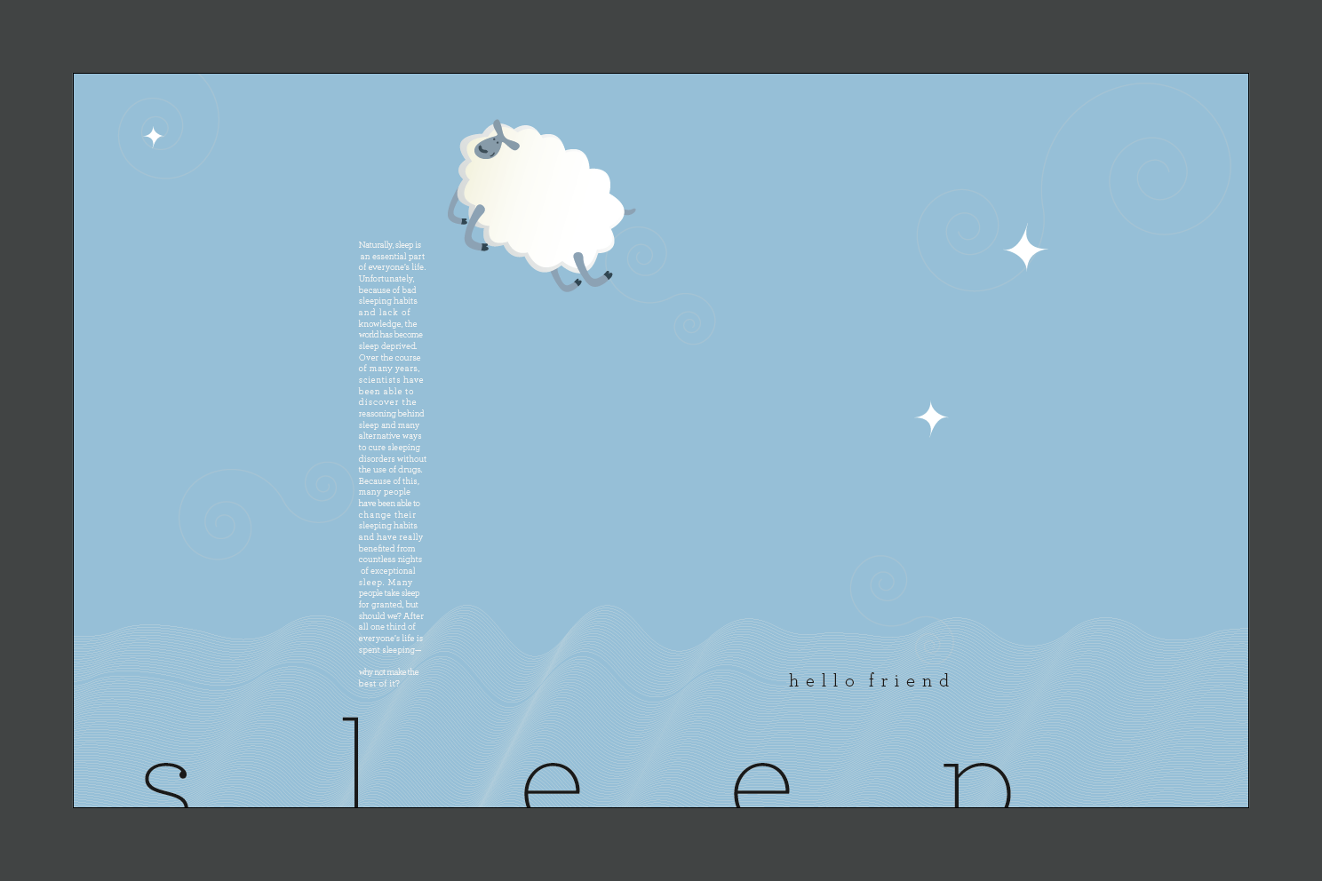
Sleep

When it comes to things I love in life, sleep tops the list. There is nothing better then crawling into bed after a long day and taking a journey to dreamland. For our final assignment we had to create a poster revolving around something we like, love, or hate. Unfortunately my friend, sleep, had not visited me for awhile and having only 48 hours to throw together a poster rough after handing in the last song poster, on top of other class work, was really stressful. I managed to crank one out at the last minute despite everything... and ironically not getting a whole lot of sleep in the process... wasn't thrilled about the outcome, but it was a good start.


My thought process started with the tile, "sleep', which I wanted to center at first because it would make the poster feel more restful. However, after playing around with location I decided that bleeding it off the bottom of the page (a bit to much I thought the next morning) would make things more restful and make it seem as if the letters were being tucked in by the surroundings. "hello friend" became the sub-head because, well, sleep is my friend. For the body copy I ended up taking the conclusion from my Sleep research paper in high school. Awesome, right? I liked how the rag looked at first, but after awhile I realized that it just didn't fit with my concept. Too jagged. I also was a bit unsure of how to fit the body text into the poster. A thin vertical paragraph seemed to work the best, but I was still troubled over it. The graphic work on the bottom of the screen was created originally from EEG scans of sleep patterns (notice the smooth delta waves...) and different stages of sleep. They could also represent blankets on a bed. I chose a very thin serif typeface (Archer: Hairline & Thin) based on two reasons: serif because it's not as bold and business-y and san serif, the serif keeps it more classic (and sleep is not an age old thing right?) and thin because it's more quiet and gentle than bold typefaces. I also enjoy the terminals on the Archer typeface: beautiful.

Ready for the revamp? I kept some of the same elements, and added a few. I changed the background to a soft blue to create more of a calming, dark feel and the body text to white. I also eliminated two of the EEG patterns and just went with the first, the way I duplicated them created a nice soft glow on the left side (as my friend Gwen said, "it looks like a soft moonlight") and reminded me of either clouds, a blanket, or delta waves as we sleep. I removed one of the lines to bring attention to it, to give a direction to the subhead. I moved the title up a bit so it didn't bleed as much and scooted it over so it wasn't as static in the center. I added a fluffy white sheep (with more fluff than body) for a few reasons. 1) Counting sheep 2) Fluffy and soft (much like a bed) and 3) it looks like a dream bubble. Adding the sheep jumping over the body text fixed the issue I was having with integrating the body text with the rest of the poster. I added a few stars to add some direction to the sky and balance the poster visually. The stars are positioned to point to different sections of the screen (the subhead, body copy, etc). During crit. Margo had also mentioned that she would like to see some subtle swirls in the background to bring a more dream like aspect to the poster. After adding those she was right, they add a nice flow to the poster that was lacking before. Anyway, here it is, my final poster of Typography 1 at CCS!

New York, New York

—deep breath—

Alright. The semester is over and summer is here. I am going to be home for a month, however, I will be returning to CCS for summer classes. Yes.

I'll slowly be adding some of the work I've been doing now that I have the time. CCS staff and students were not kidding about finals week. People DO turn into zombies, they will miss meals, a few kids will end up in the hospital because they have exhausted themselves to death. I missed a few meals (oops. I didn't have time, they were telling the truth!) and pulled a couple all-nighters in the process. But now classes are over and I've had time to kick back for the night. Feels great!

Anyway, here's a Typography assignment from awhile ago. We had 2 weeks for these posters, week one was a more rough draft with critique, second week was a final mounted poster for class. For the 11th assignment we had to create a poster about a song—visually communicating the song and it's essence.

After browsing through many songs I ended up in my jazz play lists (since it is my favorite genre) and found good ol'Frank Sinatra. Classic. I knew what I was going to do, "New York, New York". I chose the song based on a few things. 1: It's Frank. 2: The song is jazzy and has a Broadway feel to it (another favorite genre).

Here are my first results. I browsed through some websites (AIGA) and a few books hoping to get some inspiration. In TDC Annual 2008 I found a poster by Magma Brand Design. It was a design for one of their magazines. I couldn't find a decent fold out picture of the cover design online (unlike the laid out version in the book), but I enjoyed how the rag of modulated text boxes looked like a skyline. I thought maybe I could try that in my poster.


After some playing around I ended up with a different result. Instead of having the negative space form the skyline, I used the modules to create the skyline.

Here are some designs I messed around with. Didn't like any of them very much to continue editing them (some things for the assignment are missing)... but here we go.


One of my friends had mentioned how when he thinks of Frank, he gets a feeling of Art Deco. Even though that period ended right about when Frank was coming to fame, I did see a similar feeling between the two. I thought I would run with that. Here are some spin offs... none of which I really liked either, but by the end of the night I had to present something in class, even though I was not happy with my designs. Here are the two I had for a rough crit.


Rough, I know. Not sure why I chose the colors on the last one. The color sort of reminded me of a shirt one of my friends wore that was of a cityscape with the similar color them. Crit was as a figured, needed some work, but I was ready to just start all over.

Margo, my wonderful professor, had noticed my struggle with the poster and send me a message after class:

"Hi Jake,

I was just thinking about you and your song poster. Jake, could you be struggling with this one because you have not really worked out what you want to say about Frank and the song New York? In some way I think you might think your job is to interpret what the song means.

Instead, show us how the song makes you feel. Why did you pick that song? Why are you drawn to it? Is it Frank or the city? If it's not the city, do you have to show it? If it is the city are you really communicating the expanse or excitement with a silhouette?

Lastly, remember the Paula Scher work we saw today--the way Paula styled and arranged the type and images on her noise/funk posters provides a frenetic feeling of fast music, movement and dancing. http://www.hillmancurtis.com/index.php?/film/watch/paula_scher/

Contact me if I can help.

Margo"

This in turn completely changed my thinking around about how I should do my poster—it made sense. After some drafting and some sketching I went to work. Here are the results of my final song poster:


Here's a look into some of my thinking. I chose the old microphone because I felt it emulated best what Frank was about: pure classic talent. If you look closely the lyrics of the song are within the microphone and run seamlessly into the title of the song, "New York, New York". The pattern design originated from the idea that I would duplicate the skyline of New York in a pattern. This way I could bring some of the city into the poster, the business. I messed with a few pattern designs before I came to rest on the final one. I chose this one based on the rhythm in the song. If you listen to the song the lengths of the notes go: "short, short, long, short—short, short, long, short", which, I brought into my pattern. If you look closely you'll see what I mean. I chose black and gray as a color as they represent buildings the best... as most city are very gray in color. I put in random yellow skylines to add a splash of color—and what better color to pick then the New York taxi?

The final thing I struggled with was his name. Initially I wanted to map out his name in the streets of Manhattan. However, that failed and ended up looking like a little kid drawing unfortunately. So instead, I used the typeface Gotham and put it amongst the skyline (as if they are buildings themselves, rising above the NY skyline).

To me, the song celebrates one of the most inspirational cities on the globe. A celebration of New York and it's culture—a city the world looks to for the latest, and greatest. It's busy, classy, epic, and in your face—all things I tried to incorporate into my poster design. Any feedback? Let me know what you think!

Monday, April 19, 2010

Typography I Posters

For this assignment we were given a type classification. I was given Neo Grotesk. We had to research the typeface and include specific information on our posters. We were allowed to create our head and subhead for the project as well. Much more freedom than previous assignments. Additionally, this was the first time in which we could use color.

We had to create two posters, one all orthogonal, and the other could have more expression. I ended up with a couple designs I think work well, so I used all four.